
John Reed Fitness
Fitness reimagined.
-

Millennial vibes
John Reed Fitness isn’t your run-of-the-(tread)mill health club. Their vibe is bold, irreverent, and inclusive with a core audience of hip, urbanite millennials. We worked together to build a brand voice that was pithy, fun, and unique.
-
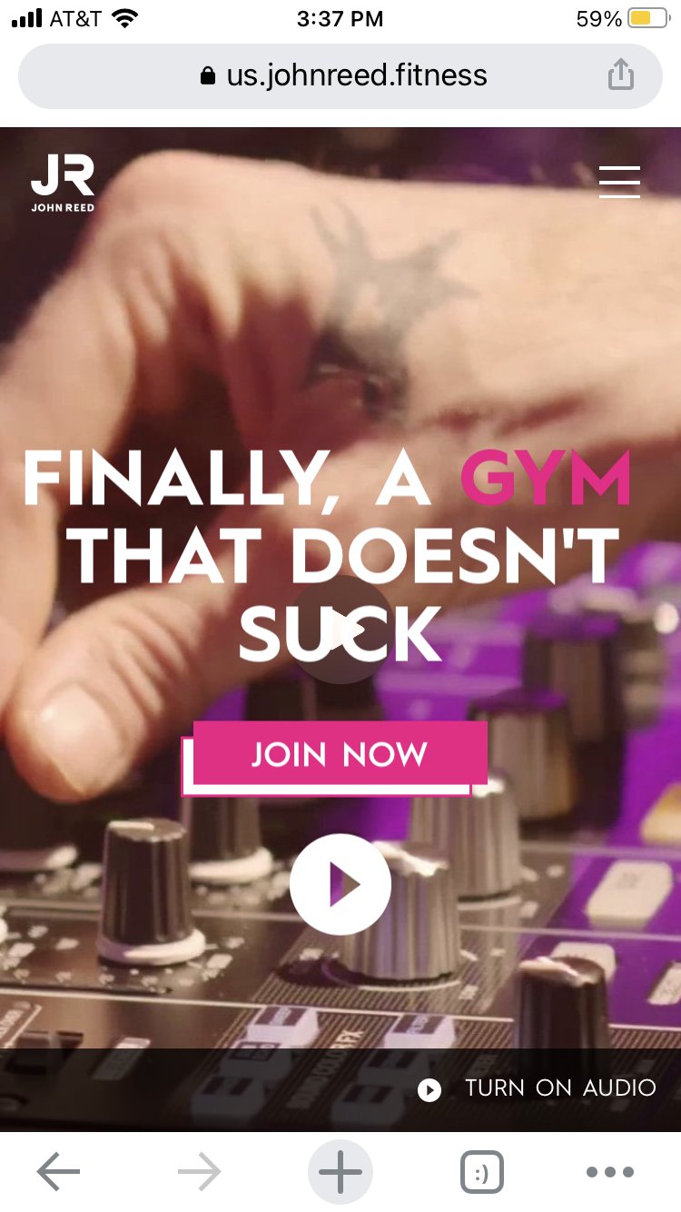
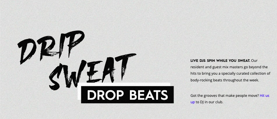
With a foreign accent
Founded in Berlin and with outposts in several of Europe’s most glamorous cities, the team at John Reed wanted to emphasize the show-stopping design and music elements that set their clubs apart. This exciting heritage presented a bit of a twist: maintaining the spirit of the original German copy while giving it a thoroughly American vernacular. Thanks to John Reed’s gorgeous visual assets and my cheeky copy, nothing was lost in translation.
-
While extremely online
When the pandemic hit, John Reed’s launch plans changed. With restrictions in place for health clubs and decreased face-to-face interaction, making a statement online became more important than ever. We worked together to create impactful website, social, and app copy that hit the mark. Since nightclubs were closed at the time, their tagline hit all the harder: “LA’s Hottest New Club Is a Gym.”